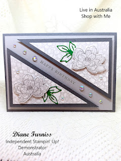
Hello and welcome to week 46 of the colour creations blog-hop. we are featuring Smoky Slate this week. Although this is a lovely Neutral Colour, part of the Neutrals Collection I still have trouble using it. I teamed Smoky Slate with Basic Gray for my card this week and was happy with the results.
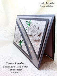
So I started with a Basic Gray card base added the Smoky Slate layer. Then added the 2 triangles in Basic Gray topped with the beautiful Abigail Rose DSP which is in Smoky Slate. I then stamped the 2 flower in the same DSP and cut them out with the dies from the Cottage Rose Bundle. I added a little extra colour by cutting out the leaves in Garden Green. I stamped the Happy Birthday from the same set on the slant and finished off the front with the Iridescent Rhinestone.
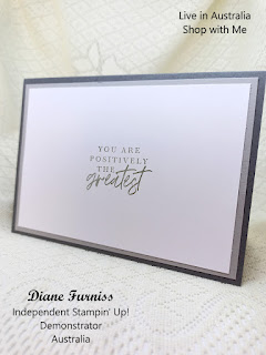
Placing the rhinestones either side of the sentiment and then a few more on the DSP. I mirrored the layering on the inside of the card, and keeping is simple I stamped the message using Smoky Slate Ink.
All the items used in this week project can be found in the 2022-2023 Annual Catalogue. If you would like the know more about these product of the project please feel free to contact me either by Email, PM or phone.
To catch up with the next person on the Hop please follow the link button below to-: Rachel Woollard
If the next button link is not working or you’d like to see the entire list of participants go to Catherine Proctor's Blog from Here


Your triangles add great visual interest to your card, Di. I really like the angle of your sentiment too.
ReplyDeleteI do like the sentiment running between the two triangles, really striking. Snap with the DSP, good choice!
ReplyDeleteA lovely card Di. I love the way you have used the Smoky Slate Abigail Rose DSP in 2 triangles then adding the smaller flowers on top. xxx
ReplyDeleteSuch a lovely card Di and I love the orientation of the sentiment for a change.
ReplyDeleteAvery elegant card Di. Totally agree with others about the design and your use of the triangles.
ReplyDeleteGreat card Di! Very elegant colours and layering - even the inside is so lovely with that double border.
ReplyDeleteLove the split panel look Di, and looking very elegant too.
ReplyDelete